The current curated gallery: 20 published references, 29 original figure assets. Eight stronger replacement constructions; no self-generated substitutes. See the mechanism, study the composition, and adapt the visual construction to your own science.
These are published calibration references, not figures generated by this skill.
01
Begin with a question, not a chart.
The agent extracts one defensible relationship from your context, mechanism, evidence and output constraints.
0:00 / 1:00
Real reference figures. Editorial motion. No simulated agent results.
Read the walkthrough
Question. Start from project context, the scientific mechanism, actual evidence and output constraints. State one relationship the reader must see.
Study. Open two real approved figures. Record how their geometry, composition and annotation make the relationship visible.
Construct. Map that visual operation to the project's true entities and update. Here, attention follows DreamFusion's state, rendering, fixed evaluator and return update; this is a reading of a published example, not new research.
Critique. Test the rendered figure against its evidence, a captionless prediction and the chosen references. A score below the policy threshold triggers a revision, not an inflated evaluation.
Deliver. Provide an editable figure, final-size preview, caption, generating code/evidence and a review bound to those exact files.
Possibilities. Physical substrates, local-to-global dynamics, geometric computation and persistent correspondences are among the visual constructions the skill teaches. The displayed results belong to the original publication authors and are calibration targets, not outputs of the skill.
20 of 20 references
01 · Nature · 2021
AlphaFold / triangle updates
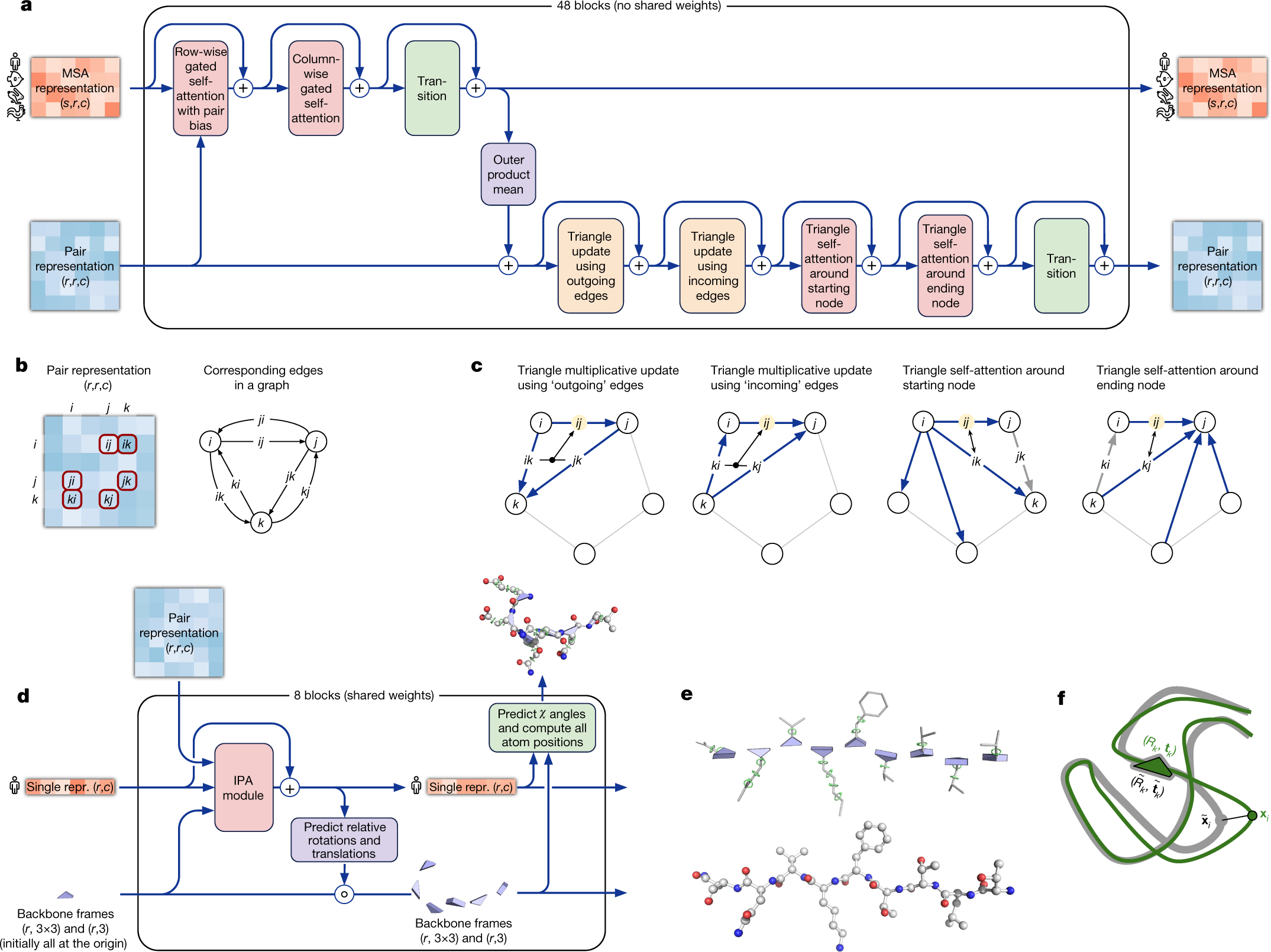
Figure 3 · Unfold indices into relationships
Look here
In panel b, match selected matrix entries to edges between residues i, j and k.
In panel c, follow the blue edges through the third residue.
In the full figure, relate these local updates to the structure module and its explicit residue frames.
Mechanism
Updating a residue-pair representation incorporates information involving a third residue.
Visual construction
Unfold indexed tensor entries into a graph triangle; keep edge orientation visible across update variants.
The eye understands
The i–j relation can be informed by relations passing through k. Index notation becomes a route.
Why this is stronger
A matrix or module diagram hides the three-way dependency. The triangle lets the reader trace it.
What the agent must learn from this style
The same indices label matrix cells, graph edges and triangle operations. The surrounding architecture stays quieter than the selected local update.
In your project: Use an aligned overview-plus-mechanism composition. Let geometry carry the index relationship; repeat identifiers and selectively emphasize the active edges rather than coloring every module.
Apply this construction in another scientific project
Map the objects. Residues → your entities; pair entries → relational state; triangle routes → the actual dependencies in the update equation.
Keep the relationship. Use the same entity labels and edge orientation in the equation, matrix and geometric view.
Select one output relation and the smallest set of inputs needed to update it.
Expand its indices into entities arranged so each dependency is traceable.
Place the algebra next to those same routes; emphasize only the active terms.
Acceptance test. Can every highlighted edge be matched to a term in the update? Do not imply physical transport or causation when it is only computation.
Do not copy literally. Do not draw triangles merely because the method contains three modules.
Scientific boundary. These arrows describe computation, not experimental causal evidence or a guarantee that every geometric constraint is satisfied.
02 · Nature Methods · 2022
CellRank
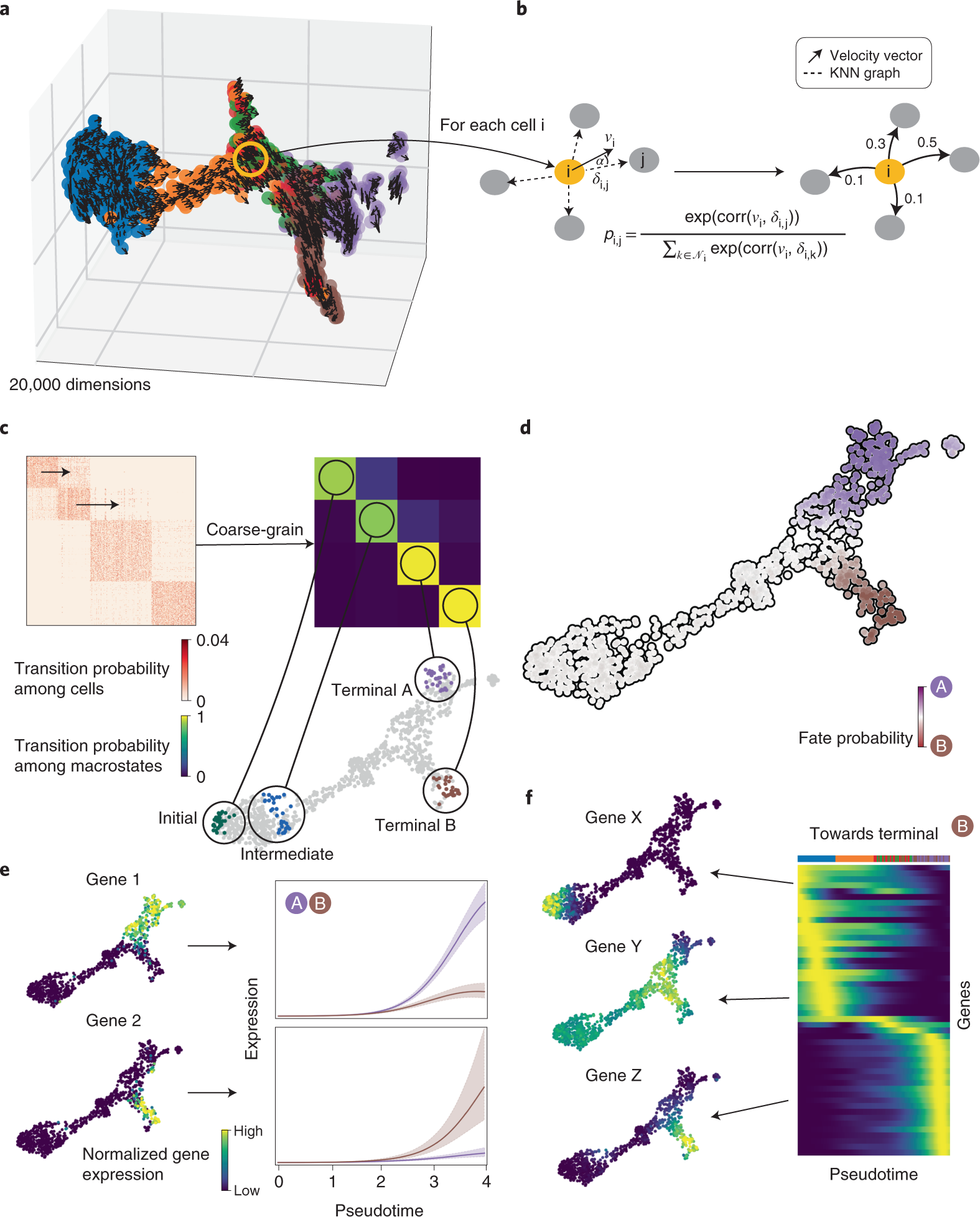
Figure 1 · Connect a local rule to a global future
Look here
Find the highlighted cell and its velocity in a–b.
Watch alignment with neighboring states become weighted transitions.
In the full figure, follow the transition matrix into macrostates and fate probabilities on the same population.
Mechanism
A cell's inferred expression velocity biases transitions toward compatible neighboring expression states.
Visual construction
Magnify one cell from the population. Turn angular agreement with its velocity into outgoing edge weights.
The eye understands
Neighbors ahead of the motion become more likely next states; proximity alone is insufficient.
Why this is stronger
A colored cell map shows groups. This enlargement shows the local rule from which directed fate estimates are built.
What the agent must learn from this style
A highlighted cell connects the population view to a magnified neighborhood, transition structure and fate map. The same scientific state persists across scales.
In your project: Compose the local rule and global consequence as one readable progression. Use repeated state identity and anchored enlargements; keep uncertainty and inferred transitions distinct from observations.
Apply this construction in another scientific project
Map the objects. Cell → your state; neighborhood → admissible next states; edge weight → transition probability; terminal fate → long-run outcome.
Keep the relationship. Preserve state identity through local graph, transition matrix and global map. Distinguish inferred transitions from observed histories.
Enlarge one state and label its possible next steps.
Show how the update defines their relative probabilities.
Compress the same transition system into macrostates and show the resulting outcome distribution.
Acceptance test. Can the reader trace a global claim back to its local update? Check probability normalization and model assumptions.
Do not copy literally. Do not treat distances in a 2D embedding as the high-dimensional transition rule.
Scientific boundary. Transitions use high-dimensional expression information, not distances in the displayed embedding. Inferred fates are not directly observed lineages.
03 · Science · 2023
GraphCast
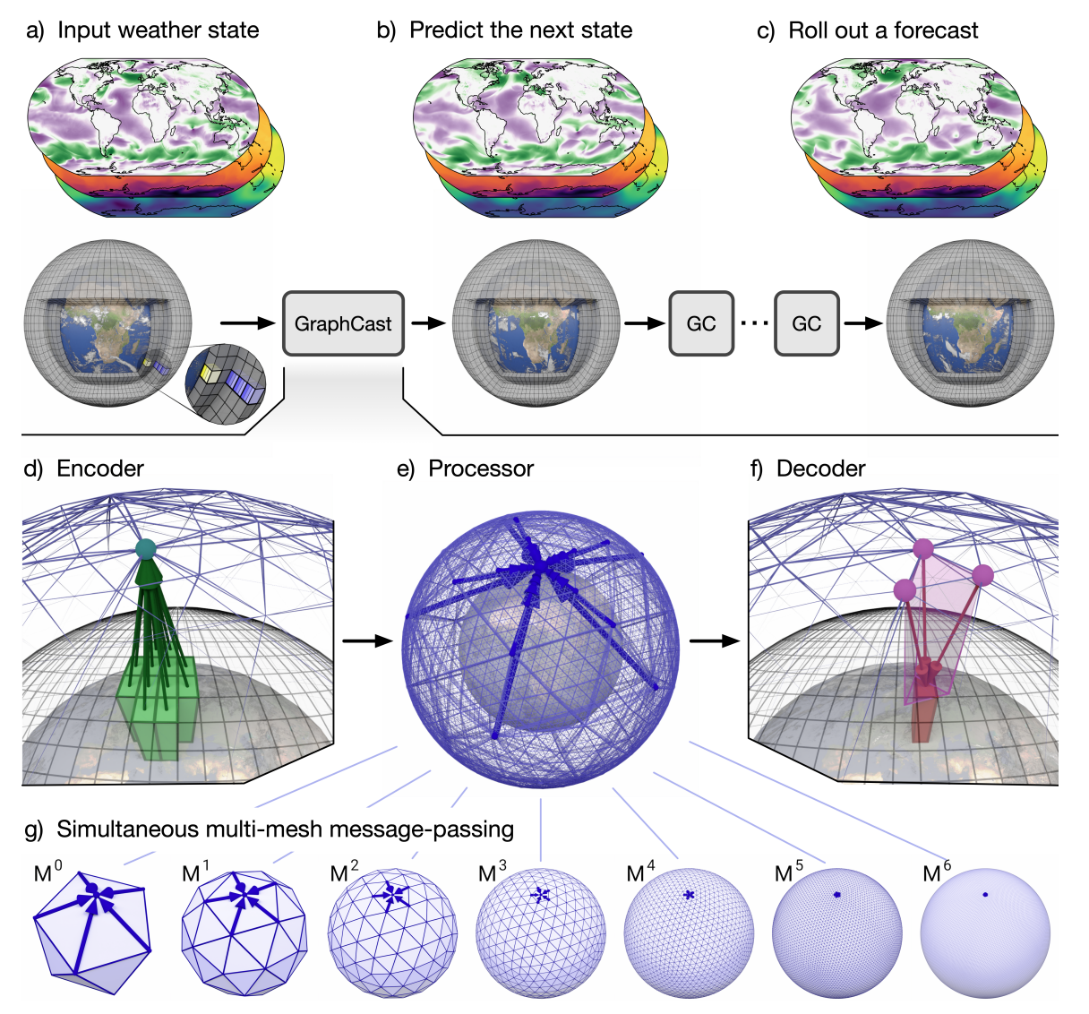
Figure 1 · Keep the natural geometry on screen
Look here
Find the same globe at input and forecast output.
In d and f, trace grid points into mesh nodes and back again.
In g, compare short and long mesh edges: different spatial reaches belong to one processor.
Mechanism
A graph network maps weather fields onto a spherical multimesh, exchanges information, and decodes the next weather state.
Visual construction
Keep Earth as the common surface; enlarge grid-to-mesh and mesh-to-grid transfers and expose the hierarchy of edge lengths.
The eye understands
Information changes representation and spatial reach, while remaining attached to the same physical world.
Why this is stronger
A forecast score hides the computation's spatial organization. These linked geometries show where and across what scales information is exchanged.
What the agent must learn from this style
Earth remains visible through grid, mesh and output. Enlargements expose the transfers; the lower mesh row makes scale differences directly comparable.
In your project: Anchor computation to the real spatial substrate. Use one consistent viewpoint and local magnifications to reveal representation changes; reserve strong color for active transfer or communication paths.
Apply this construction in another scientific project
Map the objects. Earth → your physical domain; grid → observations; mesh → computation graph; mesh levels → interaction scales.
Keep the relationship. Distinguish measured grid, computational mesh and predicted field. Keep their spatial correspondence visible.
Use one physical domain as the anchor across input, computation and output.
Enlarge one transfer between representations so the mapping is explicit.
Reveal how different edge lengths or scales extend communication across that domain.
Acceptance test. Can the reader locate where information enters, travels and returns? Verify the actual graph adjacency and coordinate transforms.
Do not copy literally. Do not replace an arbitrary latent graph with a globe unless its geometry is genuinely spatial.
Scientific boundary. The graph depicts learned communication, not literal atmospheric transport. Forecast validity requires separate evaluation.
04 · ICLR · 2023
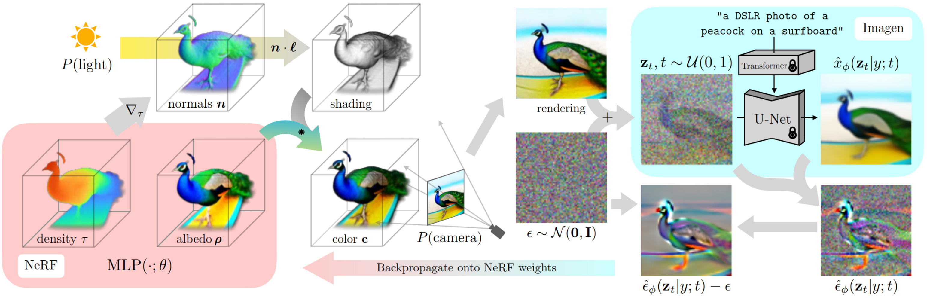
DreamFusion
Figure 3 · Return the update to its object
Look here
Follow the peacock from density and albedo to a shaded camera rendering.
Follow the noisy image through the locked, frozen diffusion model.
Follow the bottom arrow back to the NeRF weights: this is the object being optimized.
Mechanism
A pretrained 2D diffusion model supplies a score-distillation update for a rendered, trainable 3D representation.
Visual construction
Reuse the same object across intermediate representations; show frozen-model locks and an explicit return path to the NeRF weights.
The eye understands
A fixed image prior can guide changes in a different representation through its differentiable rendering.
Why this is stronger
A loss curve cannot show what is fixed, what changes, or how a 2D signal reaches a 3D object.
What the agent must learn from this style
The peacock persists through density, appearance, rendering, noise and feedback. Large grouped regions and the returning arrow distinguish trainable state from a frozen evaluator.
In your project: Keep one recognizable object across views and route feedback back to its exact mutable state. Use grouping and annotation to distinguish fixed versus trainable parts; do not draw an empty generic feedback loop.
Apply this construction in another scientific project
Map the objects. NeRF → your mutable state; rendering → observable prediction; frozen prior → evaluator; residual → update signal.
Keep the relationship. Distinguish mutable state from fixed evaluator. Preserve the identity of the object across views.
Place the mutable object on the left and its observation above the loop.
Show the actual discrepancy or feedback at the right, not a box labeled loss.
Route the update back to the precise parameters or parts that change.
Acceptance test. Can the reader identify what changes and what remains frozen? Verify that the displayed feedback is the implemented update.
Do not copy literally. A circular arrow alone does not explain an optimization mechanism.
Scientific boundary. The returned signal is not a ground-truth 3D measurement. The picture does not establish that the result is unique or geometrically correct.
05 · SIGGRAPH / ACM TOG · 2013
Mechanical Characters
Figures 2 and 3 · Let the mechanism grow inside the same object.
Look here
Follow the same character from a to f; its foot path is the persistent target.
In b–d, trace the red motion curve into a linkage, then follow the gears connecting the drives.
Compare e with the fabricated object in f; inspect related Figure 3 to see which paths different mechanisms can trace.
Mechanism
A desired cyclic motion is converted into constrained linkages, then connected through a gear train so one actuator drives the character.
Visual construction
Let the mechanism grow inside the same object.
The eye understands
The sketched path becomes a linkage; the linkage becomes a connected, physically fabricated mechanism.
Why this is stronger
A motion-error curve reports fit. Keeping the character and its actuation points in place exposes which physical structures make the movement possible.
What the agent must learn from this style
The character silhouette and red actuation curve persist while yellow and green gears accumulate. The visual sequence introduces physical complexity without changing the reader’s coordinate frame.
In your project: Grow the implementing structure around one persistent scientific object; use color to distinguish target behavior from the parts that realize it.
Apply this construction in another scientific project
Map the objects. Replace the character with the project object, its motion curve with the desired behavior, and linkages with the actual constraints or operators that realize it.
Keep the relationship. Keep the target object, actuation point, motion phase and intended path identifiable at every step.
Show the desired behavior directly on the object rather than in a separate specification box.
Add only the parts that implement that behavior; expose their connections in the same coordinates.
Finish with the realized object and a matched behavior check, distinguishing rendering from fabrication.
Acceptance test. Can a reader point from one segment of the desired motion to the component that constrains it?
Do not copy literally. Do not put decorative gears behind a non-mechanical process or infer accuracy merely because a mechanism can be drawn.
Scientific boundary. The paper targets cyclic motions and a constrained library of assemblies. The overview is not a universal synthesis guarantee; fabrication and fit require separate validation.
06 · IEEE VIS / TVCG · 2024
Aardvark
Figure 1 · Make the figure perform the join
Look here
In b, the tree provides the structure; the orange trace lives inside each branch's lifetime.
The purple cell images are attached to specific points on that trace.
Compare c and d: changing the question changes which modality supplies the main layout.
Mechanism
Lineage, measured change and microscopy evidence describe the same cells and events but answer different questions.
Visual construction
Choose tree, time series or image as the host; nest or overlay matching evidence where the corresponding event occurs.
The eye understands
The reader can connect a change to its ancestry and image evidence without mentally joining separated panels.
Why this is stronger
A line alone cannot reveal whether a drop is a biological event or a tracking error. Attached images make that distinction inspectable.
What the agent must learn from this style
Tree, measurement and image motifs remain identifiable when one becomes the host layout. Repeated colors communicate modality roles; nesting communicates event ownership.
In your project: Let the primary scientific question determine the host geometry. Attach evidence at the exact matching event and preserve modality identities; do not scatter related evidence into decorative cards.
Apply this construction in another scientific project
Keep the relationship. Use exact identity and time keys to join modalities. A host layout is not proof that all values share the same units.
Choose the main question: ancestry, change over time, or movement in space.
Let that variable set the layout, then attach the other evidence at the matching event.
Show critical transitions by default; reveal secondary detail without moving the host structure.
Acceptance test. Can a reader inspect the raw evidence for a suspicious event without searching another panel? Validate every time/entity match.
Do not copy literally. Co-location is not enough: a screenshot near a curve must correspond to the same event.
Scientific boundary. Figure 1 presents a design grammar, not experimental proof. Different host layouts do not imply that all modalities use one metric coordinate system.
07 · SIGGRAPH / ACM TOG · 2014
Computational Caustics
Figures 1 and 2 · Make the desired image become a physical ray map.
Look here
Locate the light source, transparent surface and receiving screen; keep their roles distinct.
Follow the target irradiance backwards into the transport assignment and the corresponding surface-normal field.
Use related Figure 1 to connect the optimized physical acrylic surface with the projected caustic as it rotates.
Mechanism
A transport map from source to target irradiance specifies surface normals; surface optimization produces a refractor whose light distribution approximates the target.
Visual construction
Make the desired image become a physical ray map.
The eye understands
Moving light on the receiver requires changing where the surface sends each ray—not painting the surface with the target picture.
Why this is stronger
An image-error score hides the inverse-design dependency. The linked receiver, transport map, normals and refractor make the dependency inspectable.
What the agent must learn from this style
The same receiver plane makes source and target distributions comparable; ray direction, normal direction and physical surface remain attached, not split into abstract module names.
In your project: Expose the inverse map from a desired field to local controls, then return to a measured physical consequence.
Apply this construction in another scientific project
Map the objects. Replace light with the conserved or transported quantity, the receiver with the target domain, and surface normals with the real controllable field.
Keep the relationship. Preserve source/target domains, flux accounting and the mapping between a local control and its downstream effect.
Show both where the quantity starts and where it must arrive.
Draw the correspondence that turns the desired outcome into local control parameters.
Place the implemented structure and its measured consequence beside that mapping; label model and experiment separately.
Acceptance test. Can the reader explain how changing one local surface region changes a particular part of the received pattern?
Do not copy literally. Do not borrow ray geometry for a process with no defensible transport mapping, or imply exact image recovery from an illustrative example.
Scientific boundary. The surface is an optimized approximation under an optical model. Target imagery and physical photographs have their own rights and are not new evidence for another project.
08 · Nature Communications · 2025
Reconfigurable Photonic Braids
Figure 1 · Give an algebraic operation a traversable physical route.
Look here
Trace one input waveguide through the layered chip rather than beginning with the matrix notation.
Zoom into b: follow steps I, II and III through the coupling regions and the auxiliary path.
Map that repeated physical block to the compact operation sequence in c.
Mechanism
A tunable photonic building block implements mode transformations through ordered couplings; connected blocks realize reconfigurable braiding operations.
Visual construction
Give an algebraic operation a traversable physical route.
The eye understands
The transformation has an ordered path through a real device; electrodes change an operation at a specific location.
Why this is stronger
A matrix equation lists a transformation. The layered device and enlarged coupling sequence show where it is implemented and how blocks compose.
What the agent must learn from this style
Gray waveguides establish the substrate, blue/red distinguish layers and couplings, and gold control traces connect visible electrodes to precise regions. A close-up resolves the local operation before a compact algebraic summary.
In your project: Place the operator on the substrate that carries it; use an enlarged local view to make the global algebra physically traceable.
Apply this construction in another scientific project
Map the objects. Replace optical modes with the project’s transported states and coupling regions with the actual operators that change them.
Keep the relationship. Keep state labels, operation order and the correspondence between abstract transformations and physical/local implementation.
Draw the real substrate with a restrained distinction between inactive context and active routes.
Enlarge one elementary operation while keeping its interfaces connected to the global device.
Align the compositional algebra with the path that implements it; expose a change in operation order only when scientifically justified.
Acceptance test. Can the reader identify which local control changes which state transformation, and trace the order of composed operations?
Do not copy literally. Do not interpret a drawn crossing as literal mode exchange without the coupling model; a braid-like shape alone is not evidence of non-Abelian behavior.
Scientific boundary. This is a device/operation schematic. The non-Abelian claim and reconfiguration performance rely on the paper’s model and measurements, not the appearance of crossed lines.
09 · Nature · 2023
RFdiffusion
Figure 1 · Keep the constraint visible while structure emerges.
Look here
Read the noising/reverse-generative sequence in a, then identify the fixed conditioning object in each row of b.
Follow each row’s persistent motif or symmetry through the intermediate structures into the final backbone.
Compare the noisy input row with the clean-structure prediction row at matched denoising steps in c.
Mechanism
Iterative denoising constructs protein backbones; conditioning supplies symmetry, a binding target or a fixed motif that constrains what the trajectory can become.
Visual construction
Keep the constraint visible while structure emerges.
The eye understands
Different design conditions change the space of possible outcomes; a fixed motif remains visible while its surrounding scaffold forms.
Why this is stronger
A designability curve reports success. Aligned intermediate structures reveal what is held fixed, what changes, and how a candidate is progressively organized.
What the agent must learn from this style
Rows are organized by a visible conditioning object; restrained, persistent colors distinguish fixed motifs from evolving structure. Matched temporal columns turn a complicated model into an inspectable transformation.
In your project: Use aligned state sequences in which the protected or conditioning object remains recognizable throughout the update.
Apply this construction in another scientific project
Map the objects. Replace the protein with the project’s evolving state and the fixed motif with the actual constraint, target or protected substructure.
Keep the relationship. Preserve the time-step alignment, conditioning identity, and distinction between current noisy state and predicted clean state.
Anchor each row with its actual constraint, shown as a tangible object rather than a text-only condition.
Show matched intermediate states with stable object identities and a common viewing convention.
Place the final candidate and its independent validity evidence beside the trajectory, without treating a plausible shape as functional proof.
Acceptance test. Can a reader identify the unchanged constraint and distinguish the current state from its clean-state prediction?
Do not copy literally. Do not copy protein imagery for a non-structural problem or imply that a smooth denoising sequence alone validates a designed function.
Scientific boundary. The figure describes model construction and examples. Structural plausibility and predicted designability are not equivalent to experimental confirmation of binding or activity.
10 · Nature Biotechnology · 2020
RNA velocity / scVelo
Figure 1 · Turn lag into an oriented shape
Look here
Read the transcription–splicing–degradation chain.
Trace the induction and repression arms in unspliced–spliced coordinates.
Notice that equal spliced abundance need not imply the same direction of change.
Mechanism
Unspliced and spliced RNA respond with a lag as a gene switches on and off.
Visual construction
Plot the two molecular quantities against each other. Fit an oriented trajectory through their joint states.
The eye understands
The same spliced abundance can sit on different arms: rising and falling states need not look alike.
Why this is stronger
One expression curve or cluster map hides the ambiguity. The phase portrait makes the missing direction geometric.
What the agent must learn from this style
A molecular processing chain sits above the joint phase portrait. Oriented trajectory arms and time/state color separate induction from repression.
In your project: Make the coupled state variables the coordinates, and directly connect the physical processing rule to the inferred trajectory. Preserve a clear separation between observed points and model-fitted paths.
Apply this construction in another scientific project
Map the objects. Unspliced/spliced RNA → your coupled quantities; trajectory arm → regime; orientation → update direction.
Keep the relationship. Keep the axes physically defined. Distinguish observed points from fitted trajectory and inferred time.
Plot the paired state variables rather than each separately against an arbitrary index.
Add the fitted or known dynamical direction and the regime switch.
Mark two states sharing one coordinate but having different futures.
Acceptance test. Does the second coordinate really disambiguate direction? Check the fitted equations and label inferred ordering.
Do not copy literally. Do not infer a closed cycle merely because a projected cloud looks curved.
Scientific boundary. This is model-based reconstruction from snapshots, not a movie of the same cells. Kinetic assumptions matter.
11 · Nature Materials · 2016
Biomimetic 4D Printing
Figure 4 · Translate a target shape into the local directions that create it.
Look here
Move from the natural form in a to its mathematical surface and extracted curvatures in b–c.
Compare the two print-path directions in d with the predicted structure in e.
Read the fabricated before/after states in f as the consequence of that local programming.
Mechanism
A spatially programmed print path controls anisotropic swelling; local orientation patterns are chosen so hydration bends a flat printed structure toward a desired shape.
Visual construction
Translate a target shape into the local directions that create it.
The eye understands
The flower is not decoration: its curvature becomes an orientation field, which becomes a printed structure that changes shape.
Why this is stronger
A final-shape image shows resemblance. The sequence through curvature and print path makes the design dependency visible.
What the agent must learn from this style
A consistent silhouette connects nature, mathematical geometry, directional paths and a glowing physical lattice; shared contours do more work than generic arrows or prose.
In your project: Let one recognizable global form pass through its geometric decomposition, local program and actual physical response.
Apply this construction in another scientific project
Map the objects. Replace the target flower with the project’s desired geometry; replace printing orientation with the local material/control direction that causes deformation.
Keep the relationship. Keep target geometry, orientation convention, stimulus and experimental scale explicit; distinguish simulation from physical specimens.
Represent the desired global form and the local geometric quantity needed to create it.
Make the fabrication/control field readable on the same shape or a clearly linked flattened domain.
Show the actual response under a specified stimulus alongside the predicted target.
Acceptance test. Can the reader connect a local direction in the program to a region of the final curvature?
Do not copy literally. Do not use a flower as a general symbol for growth; retain it only when its geometry is the design input.
Scientific boundary. The illustrated specimen and model demonstrate the stated material/printing system, not universal shape programmability for any material or arbitrary loading condition.
12 · ECCV · 2020
NeRF
Figure 2 · Keep one trace through every representation
Look here
Choose one camera ray in a.
Follow its sampled locations into color and density in b, then the depth profile in c.
Find the corresponding pixel comparison in d: the chain ends in an observable residual.
Mechanism
A learned field supplies density and view-dependent color; volume rendering accumulates these along camera rays.
Visual construction
Carry identifiable rays from a 3D scene into depth profiles and finally into pixel-color comparisons.
The eye understands
A pixel is an accumulation through space—not a color emitted by an unexplained network box.
Why this is stronger
A pipeline names the stages. Following the ray exposes the physical meaning of the intermediate quantities.
What the agent must learn from this style
The same rays connect a physical scene to sampled density/color, depth profiles and a pixel residual. Small labels describe the quantity at each transformation.
In your project: Carry one traceable query through the representation changes. Place intermediate values and the observable consequence along its route, rather than separating a pipeline from its physical meaning.
Apply this construction in another scientific project
Map the objects. Ray → your traceable query; samples → local states; accumulation → actual reduction; pixel → observable output.
Keep the relationship. Retain one trace identity through every panel, even when the representation changes.
Pick one representative query and reveal its inputs in context.
Carry its intermediate quantities into the actual aggregation.
Attach the output and measured residual at the end of the same trace.
Acceptance test. Can every stage's output be matched to the next stage's input? Verify the actual reduction, units and weighting.
Do not copy literally. A pipeline of named boxes does not show what is being transformed.
Scientific boundary. This explains image formation and optimization. It does not imply that reconstructed scene geometry is unique.
13 · CVPR · 2023
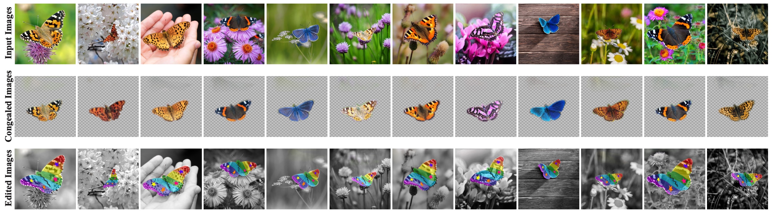
Neural Congealing
Figure 1 · Use a transported probe to show correspondence
Look here
Read one column from original butterfly to aligned butterfly.
Read across the aligned row: corresponding parts occupy common coordinates.
Inspect the transferred edit below: it follows the corresponding part back into each original pose.
Mechanism
A shared atlas maps corresponding semantic parts into common coordinates despite pose and appearance changes.
Visual construction
Align real objects, then propagate one localized edit back through their different shapes and viewpoints.
The eye understands
The edit stays attached to the corresponding part rather than to a fixed image location.
Why this is stronger
An average matching score hides what was matched. A transported edit makes the correspondence inspectable.
What the agent must learn from this style
Original, aligned and edited images form consistent rows with each specimen in the same column. A localized edit visibly follows the corresponding semantic part.
In your project: Keep specimen order fixed and use actual input images. Compare transformations vertically, then transport one localized probe back to every original; let repeated correspondence organize the composition.
Apply this construction in another scientific project
Map the objects. Butterfly part → your persistent feature; atlas → reference coordinates; edit → localized test probe; inverse warp → transfer back.
Keep the relationship. Use the same localized probe across cases. Keep the original examples visible so alignment is not mistaken for identical inputs.
Show diverse unaligned inputs in a fixed order.
Place their transformed versions directly underneath.
Apply one probe in common coordinates and display its return to every input.
Acceptance test. Does the probe remain attached to the intended feature? Include failures and cases outside the fitted regime.
Do not copy literally. Consistent coloring alone is not proof of a correct correspondence.
Scientific boundary. Selected successes demonstrate correspondence qualitatively; they do not establish reliability over all inputs.
14 · Nature Communications · 2024
Diffusive Mechanical Machines
Figure 5 · Show time as a wave of changing geometry.
Look here
Track the white ball and the evolving row of mechanisms down the time-stamped photographs in a.
Compare the sequential releases in b with the four-bar linkage in c.
Trace the stretch–relaxation–unloading cycle in e and relate it to the trajectory in d.
Mechanism
A relaxation-driven transition propagates through a structured sheet; coupling its local shape changes to linkages produces spatially sequenced transport and actuation.
Visual construction
Show time as a wave of changing geometry.
The eye understands
The moving object advances as the transition travels through the material; different positions are different stages of the same operation.
Why this is stronger
A displacement-versus-time curve loses the mechanism’s location. Time-stamped specimens and the linkage cycle attach movement to the local change that produces it.
What the agent must learn from this style
Repeated photographs keep the same physical stage while the event progresses; the local linkage and color-coded cycle explain the sequence instead of replacing it with a timeline alone.
In your project: Put measured time on the unchanged physical scene, then attach a local geometric cycle to the event it generates.
Apply this construction in another scientific project
Map the objects. Replace the sheet with a distributed state system, the kink with a local transition front, and the carried object with the consequence whose position matters.
Keep the relationship. Keep specimen orientation, timestamps, actuation sequence and energy/stimulus accounting; a snapshot montage is not automatically a tracked trajectory.
Use matched camera views with the same landmarks across time.
Expose one local mechanism at the moment it changes the observable outcome.
Link that local cycle to the space-time propagation, with measured versus simulated content clearly separated.
Acceptance test. Can the reader locate the advancing transition and relate it to the transported or released object at each time?
Do not copy literally. Do not draw a traveling wave merely to imply causation, or describe stored/relaxing energy as energy-free motion.
Scientific boundary. The paper’s material relaxation and loading history are essential. Photos and simulations have distinct evidential roles; the figure does not establish unrestricted autonomous actuation.
15 · ICML · 2023
Multisample Flow Matching
Figure 2 · Put the intermediate work beside its computational cost
Look here
Read density evolution from left to right using the common time columns.
Compare when the checkerboard structure begins forming in different rows.
Move to the right-hand solver outputs: inspect what survives at a small number of function evaluations.
Mechanism
The coupling changes the intermediate probability path and how well a coarse numerical solver reaches the target.
Visual construction
Align whole density evolutions across methods. Attach matched low-budget outputs to the same rows.
The eye understands
Some paths acquire checkerboard structure early; others leave difficult rearrangement until late.
Why this is stronger
An endpoint score hides when the work happens. The sequence ties intermediate structure to a visible computational consequence.
What the agent must learn from this style
All methods share the same time columns and spatial domain; budget-limited outputs are attached to the corresponding row.
In your project: Use rigorously matched small multiples so the moment structure appears can be compared by eye. Keep time, normalization and solver budgets aligned; distinguish density snapshots from particle trajectories.
Apply this construction in another scientific project
Map the objects. Density → your evolving state distribution; time columns → matched stages; solver columns → matched compute budgets.
Keep the relationship. Use consistent time, domain and display scale across methods. Do not confuse distribution snapshots with particle trajectories.
Align a small set of informative intermediate stages across methods.
Place the budget-limited output beside each corresponding evolution.
Connect the observed difference to a measured numerical or computational consequence.
Acceptance test. Is the claimed mechanism visible before the endpoint? Match compute and inspect whether the intermediate difference predicts the result.
Do not copy literally. Do not choose different favorable timesteps for different methods.
Scientific boundary. These are density snapshots, not individual trajectories. The 2D example does not establish universal low-step performance.
16 · Nature · 2022
Grid-cell topology
Figure 2a–b · Quotient out repetition; expose the underlying organization
Look here
In panel a, follow how opposite edges of the unwrapped domain correspond on the torus.
In b, compare repeated firing fields in physical space with compact toroidal hotspots.
The same activity is organized differently because the coordinates identify periodic states.
Mechanism
Grid-cell population activity has two periodic coordinates; physical positions can revisit the same population phase.
Visual construction
Represent periodicity on a torus and its unwrapped domain. Show physical and toroidal firing maps side by side.
The eye understands
The scattered repetitions are expressions of one compact periodic organization—not unrelated peaks.
Why this is stronger
A physical heatmap shows repetition. The new coordinates reveal the shared structure behind it.
What the agent must learn from this style
The torus and its unwrapped domain make periodic identifications visible, beside physical and toroidal activity maps.
In your project: Show the original and transformed coordinate systems together, including their identification rule. Track one state through the mapping; use geometry only for the structure established by analysis.
Apply this construction in another scientific project
Map the objects. Grid phase → your periodic state; physical repetitions → equivalent instances; toroidal coordinates → justified identified variables.
Keep the relationship. State exactly which positions are identified. Keep inferred state topology distinct from physical anatomy.
Show the complicated representation alongside the transformed one.
Make the edge identifications or symmetry action explicit.
Track a single state's identity across the two representations.
Acceptance test. Does the coordinate change preserve the relation claimed? Support topology with analysis, not the appearance of a projection.
Do not copy literally. A torus-shaped rendering does not establish toroidal topology.
Scientific boundary. This is a topology of population activity, not an anatomical doughnut. It does not by itself prove a specific biophysical circuit.
17 · Nature Machine Intelligence · 2024
Functionally invariant paths
Figure 1a · Separate the space that changes from the space that stays fixed
Look here
Find the different parameter points on the weight-space surface.
Follow their relationship to the compact group in output space.
Notice the contrast: internal movement and task-output movement have different magnitudes.
Mechanism
Parameters may change substantially while task behavior is approximately preserved, allowing other properties to be adjusted.
Visual construction
Separate weight space from output space. Show an extended set in one mapping to a compact set in the other.
The eye understands
Movement in parameters need not mean comparable movement in behavior.
Why this is stronger
An accuracy curve reports preservation. The paired spaces explain which freedom preservation can leave available.
What the agent must learn from this style
An extended set of weight-space states maps to a compact task-output set. The two spaces are kept distinct so internal change and output preservation can be compared.
In your project: Give changing and preserved quantities their own explicitly labeled spaces. Connect corresponding states and show a defined tolerance; do not mistake a conceptual surface for measured manifold geometry.
Apply this construction in another scientific project
Map the objects. Weights → your internal state; surface → feasible behavior-preserving set; output cluster → the specified invariance criterion.
Keep the relationship. Define the preserved behavior and tolerance. Do not present conceptual surface geometry as measured structure.
Draw the changing representation and the preserved representation in separate aligned spaces.
Connect corresponding states between the spaces.
Show the size of allowed output change using actual measurements where available.
Acceptance test. Is preservation verified on the intended inputs, not just one illustrated example? Label approximate versus exact invariance.
Do not copy literally. Equal task accuracy is not identical function behavior on every input.
Scientific boundary. The surface is schematic, not a measured 3D manifold or proof of exact global functional invariance.
18 · CVPR · 2025
Generative Omnimatte
Figure 1; related Figure 4 · Give an object’s nonlocal effects their own visible layer.
Look here
For one row in Figure 1, keep the input scene fixed while following the separated transparent layers.
Compare the object-removal and edited results: look beyond the foreground silhouette to its associated effects.
In related Figure 4, trace preserve/remove/uncertain trimask regions into solo videos and the common clean background.
Mechanism
Video is decomposed into object-associated RGBA layers that include effects such as shadows/reflections; removal-conditioned videos and a clean background support layer reconstruction.
Visual construction
Give an object’s nonlocal effects their own visible layer.
The eye understands
Removing an object must also account for what it changes elsewhere in the image; a silhouette mask is not the entire associated contribution.
Why this is stronger
A segmentation score hides residual shadows and incomplete objects. Exploded layers and matched removal/edit results make that distinction directly inspectable.
What the agent must learn from this style
Transparent, spatially aligned sheets turn a hidden decomposition into a stack the reader can inspect. Real scenes remain repeated at matched scale, and interventions make the decomposition testable by eye.
In your project: Make a latent decomposition spatial, then reveal its consequences through a matched edit rather than an isolated feature-importance ranking.
Apply this construction in another scientific project
Map the objects. Replace the object with the project entity and its layer with the spatially distributed contribution supported by the model or evidence.
Keep the relationship. Keep scene identity, pixel correspondence and known/estimated content distinct. A generated counterfactual is not a real-world intervention.
Show the original scene and an exploded representation of the contributions without changing their coordinates.
Place a matched deletion or edit beside the decomposition so missed effects become visible.
Expose the inference/reconstruction operation and distinguish observed pixels from generatively completed regions.
Acceptance test. Does the comparison expose effects outside the object mask, and are inferred/filled pixels labeled honestly?
Do not copy literally. Do not equate an attention map or generative completion with causal proof; do not silently label hallucinated occluded content as observed.
Scientific boundary. These are published model outputs. The authors report limits for physical interactions and difficult associations; RGBA color layers do not model every shape-changing effect.
19 · Nature Communications · 2022
Shape-morphing kirigami
Figure 1a–f · Align the geometric input with its deformation
Look here
Read each flat cut boundary on the left.
Follow its row to the stretched three-dimensional object.
Compare outward, straight and inward boundaries with the different curvature types.
Mechanism
The cut boundary constrains deformation, guiding a stretched sheet toward different out-of-plane morphologies.
Visual construction
Pair flat precursors with their stretched forms; align positive, zero, and negative curvature cases vertically.
The eye understands
The boundary is a design input: outward curvature, straightness, and inward curvature correspond to distinct 3D shapes.
Why this is stronger
A force curve measures response. The matched objects show which geometric choice changes the kind of response.
What the agent must learn from this style
Each flat precursor is aligned with its resulting 3D shape. The boundary geometries themselves—not just numeric parameter labels—organize the alternatives.
In your project: Show design geometry and deformation in matched rows with stated loading. Let changing curvature create the visual distinction; do not imply a controlled comparison when the strains differ.
Apply this construction in another scientific project
Map the objects. Cut boundary → your design geometry; stretch → loading condition; final surface → response mode.
Keep the relationship. Align input and output by specimen. State loading conditions: the published examples do not use identical strain.
Show the actual design geometry instead of only naming a parameter.
Place its deformation directly beside it under a stated loading condition.
Arrange alternatives by the geometric relation whose change explains the response.
Acceptance test. Can the reader predict the response type from the geometry? Separate changed geometry from changed loading in validation.
Do not copy literally. Do not call unmatched loading conditions a controlled counterfactual.
Scientific boundary. The shown strains differ: 0.30, 0.65 and 1.47. These are not same-strain counterfactuals, nor a universal rule for every cut pattern.
20 · Nature Communications · 2018
Scutoids in Curved Tissue
Figure 1 · Let a change of neighbors become a three-dimensional shape.
Look here
Compare the prism and frustum assumptions in a–b with the nested apical/basal surfaces in c.
Follow the same colored cells between the two surfaces; identify which neighboring relationships change.
Inspect d and g: the extra vertex and triangular face give that neighbor transition a physical geometry.
Mechanism
Packing between differently curved apical and basal surfaces can involve neighbor exchanges along cell depth; a scutoid has a vertex arrangement that permits such a transition.
Visual construction
Let a change of neighbors become a three-dimensional shape.
The eye understands
The two surfaces need not have the same adjacency. The intermediate cell geometry explains how one tiling can connect to the other.
Why this is stronger
A connectivity table reports neighbors but hides where they change. The nested surfaces and isolated cell shapes make the topological transition spatial.
What the agent must learn from this style
Persistent cell colors connect the inner/outer tilings to isolated three-dimensional pieces; translucent surfaces reveal depth without hiding the interface that changes.
In your project: Show adjacency-changing structure through linked sections and one extracted local interface, not only a flattened graph.
Apply this construction in another scientific project
Map the objects. Replace epithelial layers with two linked sections of the project geometry, and colored cells with persistent elements whose adjacency changes between them.
Keep the relationship. Preserve element identity and distinguish intrinsic adjacency from distance or perspective in a projection.
Place the linked boundary sections in one three-dimensional frame.
Track a few corresponding elements and expose the location of the adjacency change.
Extract the smallest local shape that permits the global connection, keeping its interfaces visible.
Acceptance test. Can the reader point to the vertex/face where a neighboring relationship changes through depth?
Do not copy literally. Do not import a scutoid shape into an unrelated graph merely because topology is involved; the geometric packing relation must be real.
Scientific boundary. This figure develops a geometric model and examples of packing; it does not imply every curved epithelium has one universal cell geometry. The beetle panel is a naming analogy, not mechanistic evidence.
No matches. Try a scientific object, reference title or visual operation.
Every agent starts here.
Before drawing, open at least two of these actual images. Record what you see in their composition, geometry, annotation, color roles and whitespace. Map those choices onto your project. Before finishing, compare the rendered result back against the same references—not against a self-generated example or a generic diagram template.